
SLIDE 1
Aurora Colour Swatches/Palette Proposal Current vs. New colour - - PowerPoint PPT Presentation
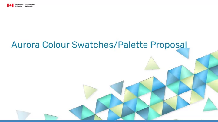
Aurora Colour Swatches/Palette Proposal Current vs. New colour swatches Aurora Borealis Colour Swatches -Main Aurora colour swatches -Evaluated the Aurora Borealis swatch, keeping that same clean and fresh look Monochrome -Creating palettes