Connecting Homeownership and Indy's Immigrant Communities Spring - - PDF document

connecting homeownership and indy s immigrant communities
SMART_READER_LITE
LIVE PREVIEW

Connecting Homeownership and Indy's Immigrant Communities Spring - - PDF document

Connecting Homeownership and Indy's Immigrant Communities Spring 2014 Why do we care about immigration? Because immigration is: Refugees and asylees are an important component of the immigrant community. Refugees are at all-time highs in


slide-1
SLIDE 1

Connecting Homeownership and Indy's Immigrant Communities

Spring 2014

Why do we care about immigration? Because immigration is:  at all-time highs in absolute numbers,  near highs as a percent of population, and  the native-born population is not growing rapidly, especially in Midwestern states. Overview of Immigration  Over 231mm immigrants worldwide (~15mm of which are refugees).  Primary areas of origin are:

  • India (~14mm),
  • Mexico (~13mm), and
  • Russian (~11mm).

 Primary destinations are:

  • USA (~46mm),
  • Russia (~11mm), and
  • Germany (~10mm).

Important historical inflection points include:

  • 1850s – 1880s: Chinese immigration that is

subsequently restricted with the Chinese Exclusion Act of 1882.

  • 1850s – 1930s: Significant number of European

immigrants.

  • 1921: Emergency Quota Act, followed by

Immigration Act of 1924 establishes national immigration quotas.

  • 1930s/1940s/1950s: Great Depression and

Mexican Repatriation during the 1930s. Following WWII, U.S. population booms (so denominator goes up) while Europe is rebuilding (fewer immigrants) and existing foreign-born population ages.

  • 1965: Immigration and Nationality Act

Amendments of 1965 shifts focus from national

  • rigin quotas to family preferences and

subsequent changes emphasized employment,

  • too. National origin shifts from European to

Latin American and Asian.

  • 2000 - 2011: 9/11 followed by economic

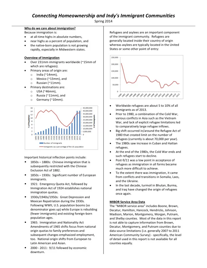
downturn. Refugees and asylees are an important component

  • f the immigrant community. Refugees are

generally located inside their country of origin whereas asylees are typically located in the United States or some other point of entry:  Worldwide refugees are about 5 to 10% of all immigrants as of 2013.  Prior to 1980, a combination of the Cold War, various conflicts in Asia such as the Vietnam War, and lack of explicit refugee limitations led to comparatively large refugee inflows.  Big shift occurred in/around the Refugee Act of 1980 that created limit on the number of refugees (currently is about 70,000 per year).  The 1980s saw increase in Cuban and Haitian refugees.  At the end of the 1980s, the Cold War ends and such refugees start to decline.  Post-9/11 was a low point in acceptance of refugees as immigration in all forms became much more difficult to achieve.  To the extent there was immigration, it came from conflicts and transitions in Somalia, Laos, and the Ukraine.  In the last decade, turmoil in Bhutan, Burma, and Iraq have changed the origin of refugees

  • nce again.

MIBOR Service Area Data The “MIBOR service area” includes Boone, Brown, Decatur, Hamilton, Hancock, Hendricks, Johnson, Madison, Marion, Montgomery, Morgan, Putnam, and Shelby counties. Most of the data in this report is not able to capture information from Brown, Decatur, Montgomery, and Putnam counties due to data source limitations (i.e. generally 2007 to 2011 American Community Survey) - specifically, the level

  • f detail used in this report is not available for all

counties equally.

slide-2
SLIDE 2

Pyxso Analytics - Making Data Speak Your Language Page 2

Population

(1) Data reflects modified MIBOR service area (i.e. PUMA 1901, 1902, 2001, 2002, 2301, 2302, 2303, 2304, 2305, 2306, 2307, 2400, and 2500). Leaves

  • ut Brown, Decatur, Montgomery, and Putnam. Data is subject to sampling

and non-sampling error. (2) Source: 1990 PUMS, 5% sample, obtained from IPUMS-USA, Steven Ruggles, J. Trent Alexander, Katie Genadek, Ronald Goeken, Matthew B. Schroeder, and Matthew Sobek. Integrated Public Use Microdata Series: Version 5.0 [Machine-readable database]. Minneapolis, MN: Minnesota Population Center [producer and distributor], 2010. (3) Source: 2000 PUMS, 5% sample, obtained from IPUMS-USA, Steven Ruggles, J. Trent Alexander, Katie Genadek, Ronald Goeken, Matthew B. Schroeder, and Matthew Sobek. Integrated Public Use Microdata Series: Version 5.0 [Machine-readable database]. Minneapolis, MN: Minnesota Population Center [producer and distributor], 2010. (4) Source: 2007-2011 American Community Survey PUMS, obtained from census.gov.

 Overall growth of about 170,000 households

  • ver ~20 year period:
  • ~140,000 from native and
  • ~30,000 from foreign-born
  • Foreign born as a % of households:
  • comprised ~2% of households in 1990,
  • comprise ~6% now, or said another way
  • foreign-born households are about 17%

(30,000 of a 170,000 change) of the household growth (fast growing segment). Nativity and Tenure

*Notes 1, 2, 3,and 4: see notes in Population

  • Changes in homeownership rates:
  • verall rate grew from 65% to 67% over ~20

years,

  • native homeownership rate grew from 65%

in 1990 to ~69% over ~20 years, and

  • foreign-born homeownership declined from

59% to 50% over ~20 years.

  • If you split the foreign-born into recent vs. long-

term (data not shown in chart and definition discussed in Length of Residency):

  • Recent foreign-born have a ~29%

homeownership rate

  • Long-term foreign-born have ~70%

homeownership rate If the foreign-born homeownership rate had simply held at 59% (1990 rate), we’d have ~3,800 additional foreign-born homeowners. So, what are the characteristics of the foreign-born in our community today and how do they compare to native-born? What might be some factors behind the decrease in homeownership rates among the foreign-born and are there potential initiatives, programs, or ideas that could make homeownership a more common

  • utcome? To answer those questions, we need to

have a better understanding of who the foreign-born are in our community. Countries of Origin Top 10 countries of origin include:

  • Mexico (34,481),
  • India (9,784),
  • Germany (5,581),
  • China (4,432),
  • Honduras (2,894),
  • United Kingdom (2,665),
  • Burma (2,539),
  • Canada (2,291),
  • Philippines (2,289), and
  • Guatemala (2,245)

This is an appropriate time to discuss some of the technical issues associated with our data source. First, because we are looking at very detailed data (i.e. more detailed than what is surveyed in the decennial census), we use the 2007-2011 and/or 2008-2012 American Community Survey data from the Census Bureau. This data is collected over a 5- year period; consequently, it does not capture very recent changes that may have occurred in very recent years. Second, because the data is collected through a survey sampling process, it is possible that the foreign-born are undercounted until they have become more established in the community. Third, also because of the survey sampling process, the

slide-3
SLIDE 3

Pyxso Analytics - Making Data Speak Your Language Page 3

data is subject to more survey error than seen with a complete census count. A good example of these issues is the Burmese numbers noted above, which local practitioners suggest is much higher. But, it is a relatively recent refugee phenomenon with cultural, economic, and linguistic barriers to assimilation. Consequently, a survey such as the one used here, may undercount such populations. Educational Attainment The following chart shows the educational attainment (i.e. years of school completed) for native and foreign-born persons 25 years of age and

  • lder.
  • About the same average for both groups:
  • native = 10.6 years of education,
  • foreign-born = 9.3 years of education, and
  • similar spike at about the 9 years of

education (foreign-born have a higher cluster with less than 9 years).

  • Foreign-born also include a bump up at 15-plus

years (far right side of graph). The following chart looks at the same issue of educational attainment, but for recent immigrants (16 years or less, or about 49% of all foreign-born)

  • vs. longer-term (more than 16 years, or about 51%
  • f all foreign-born):

 newer arrivals have greater concentrations without a high school degree (far left side of image) and  newer arrivals do not have the same concentrations at the highest levels of education (right hand side of image). Length of Residency Why did we pick +/- 16 years as the cutoff for "recent/newer" vs. longer-term residency? The chart above looks at length of residency using 2013 as base year (i.e. year = 0) so we would not expect the chart to show anyone with 1 or 2 years of residency (far left of this chart). And, since it may take a while for someone to assimilate and become comfortable responding to a survey like the American Community Survey, we might expect to see lower participation rates/undercounts for new immigrants (which is suggested in this chart). Researchers often focus on <>10 years. In the case of

  • ur region, this graph shows a break point around 16

years, or 1997. About half of the foreign-born

slide-4
SLIDE 4

Pyxso Analytics - Making Data Speak Your Language Page 4

population became residents of the United States before 1997 and about half after 1997. Why might length of residency be an issue:

  • might indicate a different motivation for

immigrating,

  • might indicate a different level of social

networking and assimilation,

  • might indicate a different level of economic or

familial stability, and

  • might indicate a different socio-demographic

status (e.g. with/without children, age, etc.). All of which might affect likelihood of homeownership. Recent Movers Of the nearly 10,000 (~23%) foreign-born households who moved in the year prior to being surveyed:

  • ~12% of movers came directly from overseas,

mostly from Mexico, India, Korea and Eastern Asia (unspecified).

  • ~ 77% came from other places within

Indianapolis region.

  • ~11% (remainder) from other places within U.S.

(1,094), mainly California, Illinois, Texas (traditional gateways). Household Income We also compared household income for native vs. foreign-born households, as shown in the following chart: For this chart, we dropped all incomes over $500k because both native- and foreign-born income distributions are noticeably skewed by a handful of households with higher incomes (over $1mm).

  • Average:
  • Native = $67k
  • Foreign = $61k
  • Similar patterns:
  • Both skewed towards lower end of income

spectrum

  • Foreign-born have higher overall shares at

these lower incomes (i.e. more skewed/steeper curve) We also looked at this data based on the same newer/recent vs. longer-term breakdown noted previously: Perhaps not surprisingly, especially in light of what we discussed previously regarding educational attainment, are the following results:  newer arrivals are skewed more towards lower income categories and  longer-term residents have broadened out into higher income categories. Employment We next looked at employment, both by industry and by occupation.

slide-5
SLIDE 5

Pyxso Analytics - Making Data Speak Your Language Page 5

Age We often talk about the baby boomers and the bump they’ve created in folks crossing the 50+ benchmark and heading towards retirement. They are followed of course by the echo-boomers. The following chart shows the age profile for native vs. foreign-born people: These data show the following results:

  • Averages for both groups are nearly identical:
  • Native = ~35.8 years
  • Foreign = ~35.8 years
  • But look how different the age profile is for the

foreign-born community:

  • The shape of the distribution for foreign-

born persons likely reflects a couple of issues, including the important role of work- related migration and the relatively high share of married couple households among the foreign-born (we’ll see this again shortly).

  • The good news is the foreign-born are

predominantly in the home buying age cohort below 50 with at least a decade or two of active employment likely still ahead. We also did a newer/recent vs. longer-term residency split among the foreign-born on the issue

  • f age, as shown in the following chart:

This chart highlights the role of family structure with newer households. We’ll see in an upcoming section that the household size of newer immigrants is skewed a little bit towards smaller households. This chart shows that newer households are skewed a little bit younger and the presence of children is particularly apparent on the left side of the left hand picture. Household Size We also considered how the household structure might differ for the foreign-born by looking at household size in the following chart:

slide-6
SLIDE 6

Pyxso Analytics - Making Data Speak Your Language Page 6

  • average household size for native-born

households is ~2.4, but the average is skewed by the significant portion in 1 and 2 person households, and

  • foreign-born average is ~3.1, but this average is

much less skewed and more evenly distributed. Potential explanations of this difference is that foreign-born households have a more traditional nuclear family and/or multi-generational structure, either of which have some support in the previous discussion regarding Age. Geographic Distribution This following chart looks at the share of foreign- born people within the Indy region. The dark green color indicates a relatively high share, the yellow indicates a “normal” or “average” share, and the brown indicates a relatively low share. It is interesting to note the similarity of Marion County (8%) and Hamilton County (7%). But, the next section on language will show us how those two counties differ within the foreign-born population. Language Another way to get a sense of racial, ethnic, or cultural diversity is through the language spoken at home. Marion County and Hamilton County have similar percentages of the population where English is not the primary language spoken at home (roughly 10%). The difference comes in the ratio of Spanish-to-Asian languages as Asian languages are much more prevalent in Hamilton County. Only ~51% of households that are “new” have someone in the home that is 14 or over and speaks English well. Demographers often refer to this definition as "linguistic isolation". About 21% of “long-term” households have someone over 14 that speaks English well. Consequently, linguistic isolation is a relevant issue for assimilation of newer/recent immigrant households. When considered geographically, linguistic isolation is predominantly, but not solely, a Marion County issue. Comparison to Other Cities We also compared Indianapolis to other cities with populations over 1.5mm people.

slide-7
SLIDE 7

Pyxso Analytics - Making Data Speak Your Language Page 7

Traditional gateways have higher concentration of foreign-born (darkest colors):  San Francisco,  Los Angeles (southern California),  Miami, and  New York. Indianapolis is most similar to other Midwestern cities:  Kansas City, 

  • St. Louis,

 Cincinnati,  Cleveland,  Pittsburgh, and  Virginia Beach. But, the story flips when we look at recent immigrants in the next image (dark blue is high % since 2000).

  • This image reflects shares (i.e. % of foreign-born

with residency since 2000 or subsequently). Older gateways have a larger, established base as the denominator of the ratio. So, it would take a lot of new immigrants to offset their base even if they were still getting a high absolute number of new arrivals.

  • And, it may reflect immigrants getting squeezed
  • ut of established gateways. So, perhaps this is

a transition of lower skilled/lower educated immigrants to the interior of the country.

  • And, as we’ve seen from the income and

education data, having “new” immigrants vs. more established ones, isn’t always positive.

  • On the other hand, it may reflect that new

immigrants see more economic opportunity in less traditional places and are looking for the same things as the other households that move here – affordable housing, safe communities, good schools, and a nice place for a family. For example, Midwestern cities look more favorable when you look at the level of education in the following image. Darker blue means the ratio of graduate degrees to "less than high school diploma" is high. Lighter blue means the ratio is low. Traditional gateways don’t look nearly as strong from this perspective, especially if places like Indiana have a younger cohort and a favorable skill set ratio. How Much Homeownership is Possible? We have seen some similarities and differences in demographics for native vs. foreign-born

  • households. And, we have noted the potential splits

within foreign-born demographics based on length

  • f residency. So, how much of the difference in

homeownership rates noted earlier is due to demographics and how much to behaviors, choices,

  • r barriers to homeownership experienced by the

foreign-born?

slide-8
SLIDE 8

Pyxso Analytics - Making Data Speak Your Language Page 8

The following chart shows the demographic variables we considered in this analysis:  the demographic characteristics associated with homeownership (versus those that have little impact) are virtually identical for both groups. You can see this by looking for places where the chart is in bold (positive effect) or italics (negative effect) in both columns.  What differs is the “value” or “level” of those demographics:

  • foreign-born households have a lower

percentage of household-heads without a high school diploma but a similar share with a college degree,

  • foreign-born households have higher shares
  • f the lower income categories, and
  • foreign-born households have higher shares

in the 25-44 age categories but fewer in the 44+ categories. Some demographic differences resolve themselves

  • ver time (e.g. people will naturally age and/or move

into higher income categories with additional work experience). But, some demographic differences are potentially subject to policy intervention (e.g. education, labor market/employment/economic

  • pportunities). Using a Oaxaca-Blinder

decomposition method to separate impact of demographics from impact of behaviors, choices, and barriers, we find about ½ of the difference in the homeownership rate is driven by demographics. The

  • ther half is unexplained and can be the result of

various factors including choices, behaviors, barriers,

  • r missing variables (e.g. citizenship). Assuming we

could address this half through a variety of measures including education, marketing, and outreach, would result in about 8,000 additional homeownership households. Is that reasonable or even possible? The homeownership rate for longer-term households suggests the answer is yes (i.e. a 70% homeownership rate). But recent arrivals do not the same educational attainment, may not have the same income potential if the education issue is not addressed, and they are not from the same countries

  • f origin (i.e. there may be cultural differences in the

preference for homeownership). Policy Options* So what are some policy options that may address these differences and make homeownership a more realizable dream for the foreign-born in Indy?  Overall

  • Develop a community-wide plan to address

immigration that establishes a coalition of common interests. Examples of this in

  • ther cities include Dayton (Ohio), Stuttgart

(Germany), and Barcelona (Spain).

  • Coordinated Refugee Service Plan in Indy
  • Enhance existing municipal services with

multi-lingual options and municipal identification card and/or additional consular services. Examples from other cities include New Haven (Connecticut).

  • Public Safety Language Access Council

 Education

  • Foster basic literacy and high school

equivalency

  • Enhance college educational opportunities

(e.g. New Haven Promise)

  • Create collaborations with employers to

enhance graduate retention, particularly around STEM

slide-9
SLIDE 9

Pyxso Analytics - Making Data Speak Your Language Page 9

 Economics

  • Connect multi-lingual liaisons within

business-oriented institutions (MIBOR, Chamber of Commerce, Indy Partnership, etc.) to broaden economic opportunities

  • Collaborate with Bank on Indy/Indy’s

Campaign for Financial Fitness

  • Improve access to business capital (e.g.

Project THRIVE in New York, mutual lending arrangements, etc.)  Housing

  • Consider immigrant enclaves (or as a subset

for inclusion) for redevelopment initiatives

  • Work with financial institutions to promote

multi-lingual mortgage education, documentation, programs, and products

*These policy options are noted for discussion purposes only and do not reflect an endorsement by MIBOR or its members.