
SLIDE 1
RESPONSIVE DESIGN mobil e ma tu e rs ide a A website should look - - PowerPoint PPT Presentation
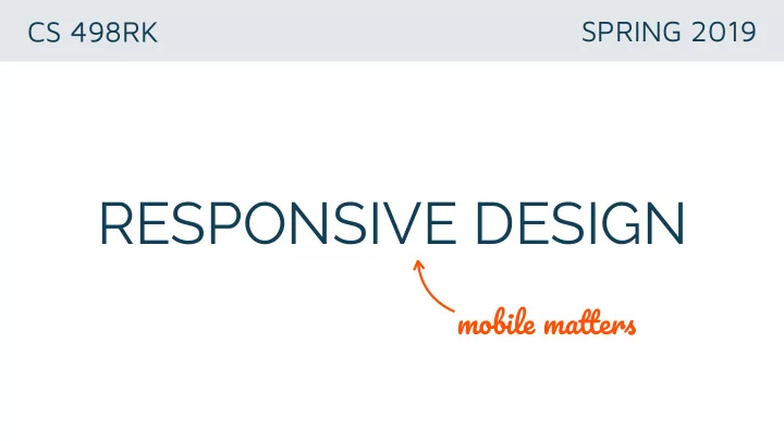
CS 498RK SPRING 2019 RESPONSIVE DESIGN mobil e ma tu e rs ide a A website should look good on every display, from wide screens to mobile devices. RESPONSIVE DESIGN Eliminates the distinction between mobile and desktop websites.
between mobile and desktop websites.
displayed differently in various screen sizes
https://developers.google.com/web/fundamentals/design-and-ux/responsive/
4% 47%
49%
https://internetingishard.com/html-and-css/responsive-design
@media only screen and (min-width: 961px) { <regular-css-rules> }
@media only screen and (min-width: 961px) { <regular-css-rules> }
<meta name='viewport' content='width=device-width, initial-scale=1.0'/>
entire desktop layout onto the viewport.
rendering responsive designs,
a <meta> tag in the <head>
https://internetingishard.com/html-and-css/responsive-design
https://internetingishard.com/html-and-css/responsive-design
website will look at every breakpoint.
Layout Shifuer, etc.)
queries.
https://internetingishard.com/html-and-css/responsive-design
to maximize code reuse.
specific (i.e. iPhone X vs Galaxy S9). Take advantage
want your content to adapt (when you don’t have enough screen real-estate), static units when you want the same look (when you have enough space).
http://blog.froont.com/9-basic-principles-of-responsive-web-design/
https://internetingishard.com/html-and-css/responsive-design https://developers.google.com/web/fundamentals/design-and-ux/responsive/ https://alistapart.com/article/responsive-web-design/ http://gs.statcounter.com/platform-market-share/desktop-mobile-tablet