
SLIDE 1
Geography, Inequality and Oxford
Danny Dorling, Inaugural lecture, 3rd February 2014
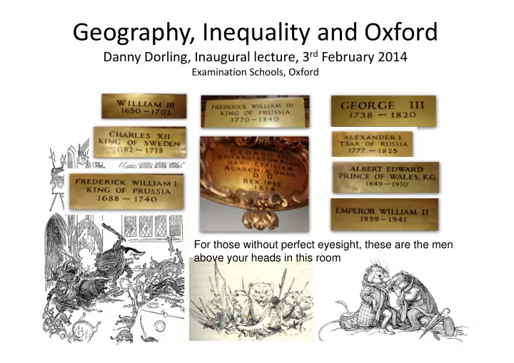
Examination Schools, Oxford For those without perfect eyesight, these are the men above your heads in this room
Geography, Inequality and Oxford Danny Dorling, Inaugural lecture, 3 - - PowerPoint PPT Presentation
Geography, Inequality and Oxford Danny Dorling, Inaugural lecture, 3 rd February 2014 Examination Schools, Oxford For those without perfect eyesight, these are the men above your heads in this room Geography, Inequality and Oxford .on a
Examination Schools, Oxford For those without perfect eyesight, these are the men above your heads in this room
….on a tributary of the Thames 'W-e-ll,' replied the Rat, 'let me see. The squirrels are all right. AND the rabbits—some of 'em, but rabbits are a mixed lot. And then there's Badger, of
you paid him to do it. Dear old Badger! Nobody interferes with HIM. They'd better not,' he added significantly. 'Why, who SHOULD interfere with him?' asked the Mole. 'Well, of course—there—are others,' explained the Rat in a hesitating sort of way. 'Weasels—and stoats—and foxes—and so on. They're all right in a way—I'm very good friends with them—pass the time of day when we meet, and all that—but they break out sometimes, there's no denying it, and then—well, you can't really trust them, and that's the fact.' The Mole knew well that it is quite against animal-etiquette to dwell on possible trouble ahead, or even to allude to it; so he dropped the subject. THE WIND IN THE WILLOWS, By Kenneth Grahame,
Author Of "The Golden Age," "Dream Days”, old boy of St. Edwards, etc.
each line does not include the group above, but is the next richest group
50 100 150 200 250 300 350 400 450 1910 1920 1930 1940 1950 1960 1970 1980 1990 2000 1 in 10,000 1 in 1,000 less 0.01% 1 in 100 less 0.1% 1 in 10 less 1%
Multiples of mean average income received by the: 1908 Wind in the Willows published 1934 the two Cutteslowe walls built in time for Christmas 1959 the walls were demolished 2008 crash, temporary dip?
Today our rising walls are invisible barriers. We don’t need deadly spikes to keep people out.
One of the two Cutteslow walls built to separate adults and children living in different types of housing in Oxford in 1934
If there were no income inequality the red line would be at 10%, green at 1%....
Total share of all income in the UK received by the:
10 20 30 40 50 60 1910 1920 1930 1940 1950 1960 1970 1980 1990 2000 1 in 10 1 in 100 1 in 1,000 1 in 10,000
1934 the two Cutteslowe walls built in time for Christmas 1959 the walls were demolished < 18 years >
wall I grew up in Oxford, some Time after the Cutteslow wall had been torn down but before the motorway to London had been finished; and before it again became as divided a city as it is today. This map from Olly O’Brien
is much the same, but the gaps are now far wider between areas. M40 error My dad’s Practice Area
Me and my brothers sometime in the 1980s I am the shy one hiding at the back…
But it was not as varied as it is today around the same roundabout: 1) Schools 2) Jobs 3) Incomes 4) House prices 5) and mortality. Like the UK as a whole, Oxford was more equal. Green Road roundabout (underpass)
Brimblecombe, N., Dorling, D. and Shaw, M. (1999) Where the poor die in a rich city: the case of Oxford Health and Place, 5, 4, 287‐300
Average positive housing equity (£). And Standardized Mortality Ratio (SMR), 100 is national average rate.
These faces represent parliamentary constituencies. Their colour represents their political complexion and
Chris Brunsdon, Stan Openshaw, Martin Charlton, me and Bruce Tether
The colour triangle shows the colours for safe parliamentary seats and for marginal seats. The two faces show the extremes of facial features. Eye size shows the proportion of employed people in service industries, Nose size shows the percentage turnout of the electorate. Mouth shape shows the percentage unemployed. The fatness of the cheeks shows the mean housing
“Sacrifice” by James Francis Horrabin, Plebs Journal, 1931 In Leeds with Phil Rees and colleagues we calculated how many people in 2001 would have to move home if spatial polarization in Britain were to be reduced to the level in
3.4%. To get rid of it completely would take 13.3% moving home.
This graph shows how near to the UK average neighbourhoods are. If this was normally distributed, you would expect a bell-shaped
with the suggestion of twin peaks. An average neighbourhood is becoming less common. Benefit Street Wealth Row
Iain Banks, writer, 1954‐2013, final interview Net lifetime immigration Net lifetime emigration Source, worldmapper, 1945-2005 These are images from Worldmapper. The size of each country is proportional to their total net lifetime migration. Because this is
the upper map appear on the lower map which are those with net emigration. Western Europe is purple, and this blob is the UK, dwarfed by the rest of Europe
2008 Countries as different as Switzerland and the Netherlands are continuing to reduce inequality, steadily and slowly over time.
Figure 3.4 of Social Mobility and Child Poverty Commission (2013) State of the Nation 2013 October 2013, London: The Stationery Office https://www.gov.uk/government/ uploads/system/uploads/attachment_data/file/251213/State_of_the_Nation_2013.pdf
Source: http://www.ifs.org.uk/comms/r81.pdf (Figure 3.17)
Office of the Children’s Commissioner (2013) A Child Rights Impact Assessment of Budget Decisions‐ children and young people's version, 27th June, http://www.childrenscommissioner.gov.uk/content/publications/content_701
Source: Figure 4 in: http://pubs.aeaweb.org/doi/pdfplus/10.1257/jep.27.3.3
This graph shows how government policies rather than global market forces have changed the status quo in different countries since 1960.
Tony Champion, Mike Coombes, David Fairbairn, Ludi Simpson and Rachel Woodward. I have written and contributed to many books, but, to be honest, have had an extraordinary amount of help to do so. Anyone who has received an email from me will probably appreciate the obvious need for that.
Dave Gordon, Ron Johnston, Dave Rossiter, Rich Mitchell, Jan Rigby, Ben Wheeler
Anna Barford and Mark Newman The whole world sized by the profits made from financial exports as measured in 2005. Along with the UK, Luxembourg and Switzerland completely dominate the picture
http://www.bbc.co.uk/blogs/thereporters/markeaston/2009/04/map_of_the_week_checks_and_the.html And this is the world, then, by financial imports:
…there is always someone who is better than you…
Ben Hennig, Dimitris Ballas, Bethan Thomas, George Davey Smith, and Mary Shaw
http://www.guardian.co.uk/news/datablog/gallery/2013/feb/11/whats‐in‐a‐ name?CMP=twt_fd#/?picture=403827997&index=0
Loughan, S. Kuppens, P. et al. (2011) Economic Inequality Is Linked to Biased Self‐Perception, Psychological Science, 22, 10, 1254‐1258, http://www.psych.unimelb.edu.au/sites/live‐1‐14‐1.msps.moatdev.com/files/Loughnan%20Psych%20Sciene.pdf Homberger, E. (2013) Marshall Berman obituary, The Guardian, September 27th, http://www.theguardian.com/books/2013/sep/27/marshall‐berman
[Sutton Trust (2011) Degrees of Success: University Chances by Individual School, London: The Sutton Trust. On the 1930s and Oxbridge entry see Political Arithmetic: A Symposium of Population Studies (1938). Editor: Lancelot Hogben, just £13 from Abebooks.
Williams, Z. (2012) What's the point of social mobility? It still leaves some in the gutter, The Guardian, May 23rd, http://www.guardian.co.uk/commentisfree/2012/may/23/social‐mobility‐nick‐clegg Berg, S. (2011) Five schools 'send more to Oxbridge than 2,000 others', BBC News, July 8th, http://www.bbc.co.uk/news/education‐14069516 Sutton Trust (2011) Degrees of Success: University Chances by Individual School, London: The Sutton Trust., http://www.suttontrust.com/public/documents/sutton‐trust‐he‐destination‐report‐final.pdf
Data from Reay, D. (2012) What would a socially just education system look like? London: Centre for Labour and Social Studies. USA Private education in the UK is much less about an alternative approach to education and far more about segregation and financially loading the dice
Cribb, J., Hood, A., Joyce, R. and Phillips, D. (2013) Living Standards, Poverty and Inequality in the UK: 2013, Institute for Fiscal Studies Report R81, (p. 30,45), http://www.ifs.org.uk/comms/r81.pdf, page 40
We are used to change being gradual, but sometimes you come to a point where the change is sudden, where it is possible to draw a line; the top 1% is such a point.
Thanks to Mark Fransham for these maps To begin to bring this to an end take a look at how segregated the city of Oxford itself has become. NS‐SeC is what in the 1930s was called “Class”. the country and city was more equal when the University built more in concrete.
NS-Sec stands for the National Statistics Socio-economic Classification.
There is an acute housing shortage in Oxford and yet there are areas where up to 5% of all homes are second homes.. A small town retreat for people who have their main residence elsewhere.
Households in some parts of Oxford use twice as much electricity a year as in
These are average consumption rates for entire areas. Consumption rates for individual households vary to a far greater extent.
Households in some parts of Oxford use as much as two and a half times more gas a year to heat their homes as in
Its not because the houses are bigger or more rooms in them are
It’s because they can.
Collini, S. (2013) This literacy report is not a story of England's national decline, The Guardian, October 8th, http://www.theguardian.com/commentisfree/2013/oct/08/oecd‐literacy‐report‐class‐failing‐schools Van den Bos, K., Van Lange, P. A. M., Lind, E. A., Venhoeven, L. A., Beudeker, D. A., Cramwinckel, F. M., Smulders, L., & Van der Laan, J. (2011). On the benign qualities of behavioural disinhibition: Because of the pro‐social nature of people, behavioural disinhibition can weaken pleasure with getting more than you deserve. Journal of Personality and Social Psychology, 101, 791‐811 http://www.paulvanlange.com/s/VandenBosetalJPSP2011.pdf
Mortality inequality is large, but lower in Oxford than elsewhere, I suspect because many of the sick cannot afford to stay and people leave the orange areas on retirement. But there is absolutely no need for gaps of this size. They were nowhere near this in the 1980s.
420
Port Meadow BARTON SANDHILLS BOTL EY SUMMERTOWN QUARRY
A34 Western Bypass
WOLVERCOTE
Botley Road
South Park RISINGHURST
A34 Southern Bypass
OSNEY JERICHO ROSE HILL COWLEY LITTLEMORE BLACKBIRD LEYS
Abingdon Road
MARSTON HEADINGTON
A40 Northern Bypass C
le y R
d I ffley R
d H igh S tr e e t M ars t
e r r y R
d A 41 4 2 E a s tern B y p a s s B anbu r y Roa d W
k Roa d Win d mill Ro a d
City Centre
Least deprived areas
Difference in life expectancy at birth
Most deprived areas
Longest life expectancy Shortest life expectancy
Thanks to Rod King and Ben Hennig for these slides
Pedestrian deaths as a % of all road crash deaths
A population cartogram shows places with an area proportional to its population, in this case 20mph areas Bellow: All causes of death of 17 to 19 year olds, Britain (2006–07 deaths) Total 20 means having a default speed limit of 20mph in residential areas except for selected roads. The causes of death pie chart is for 17 to 19 year olds, but would look similar if it was from age 5 to age 25 years: Population cartogram showing 20mph places
Authorities doing Total 20 Authorities committed to Total 20 Authorities without action yet
This is a chart about total equity, not total housing value, so it is about the relative wealth of these places as much as about the cost of housing.
“In January 2014 the Financial Times released an analysis showing that over the course of just the last five years the equity of mortgage holders in Britain had fallen by £169 billion while that of landlords had risen by a massive £245 billion. There is no surer sign of a housing crisis turning into a disaster than this” … (the estate agent Savills used geographical mortgage data at postcode level to determine this). Landlords' total equity has more than doubled from £384bn a decade ago to £818bn today. The total equity of homeowners with mortgages has dropped by £169bn because on average buyers now borrow more.
published as K. Allen, Home buyers left behind in Britain’s two‐speed housing market, Financial Times, January 18th
Effects of the cuts 2010-16
Oxfam (2012) The Perfect Storm
Schoolchildren walk through the newly broken down wall in Cutteslow in
(one of the teachers in the picture).
http://www.eyes-and- ears.co.uk/pennine/details.asp?Title=The%20Cutteslowe%20Walls
http://www.bbc.co.uk/oxford/content/articles/2009/03 /26/cutteslowe_feature.shtml
In 1934 it may have been almost impossible to imagine how many walls could be pulled down in the next 25 years as equality rose.